Organizing Big Data for Analysis
Since 2009, we have been building an index of the web for intelligence analysis. Consequently, we have lots of data at Recorded Future (billions of data points). But where does the data come from? And are we getting the same kind of data as we always have? How does the data grow?
We will show a number of graphs to convey answers to these questions. We harvest documents from (public) open sources, extract text from the documents, and analyze the text to find references of events (cyber attacks, protests, etc.) with times (both publication times and event timing inferred from language) and entities (company names, product names, IPs, etc.).
Here we will focus on sources, documents, and references. The graph below shows how our set of sources have increased since 2009. The sources shown are what we call the synonymized sources. We may have several external sources pointing to the same synonymized (combined) source. For example, we get information from different parts of BBC News from a few external sources, but all of them are tied to the same synonymized source. We have over 600,000 external sources.
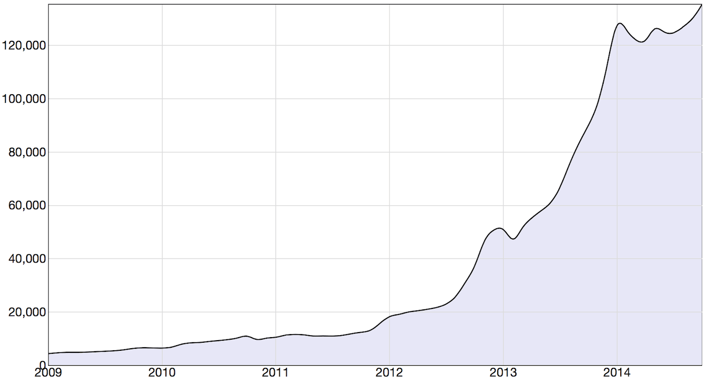
Figure 1: Active Sources Per Month (2009-2014)
300% Increase in Active Sources Since 2013 and Growing
We can see the number of active sources increased steadily but slowly until the end of 2011. In 2012 and 2013 we ramped up the number of sources at an exponential rate. A source may be inactive for two reasons: it may be deleted or it may have stopped producing new documents for us to analyze.
Data Points Extracted from Text
In the next graph we look at the number of data points extracted from text (a.k.a. references) per month found in documents from these sources. Up till mid 2012, the number of references increased in line with the number of sources. At that point we started harvesting social media, which in our system is mostly two sources: public Facebook and Twitter posts.
In mid 2014, we made a system change, also storing text fragments where we found no events or entities as references. These references are only searchable with free text. As can been seen in the graph, that change made a very big impact on the number of created references.
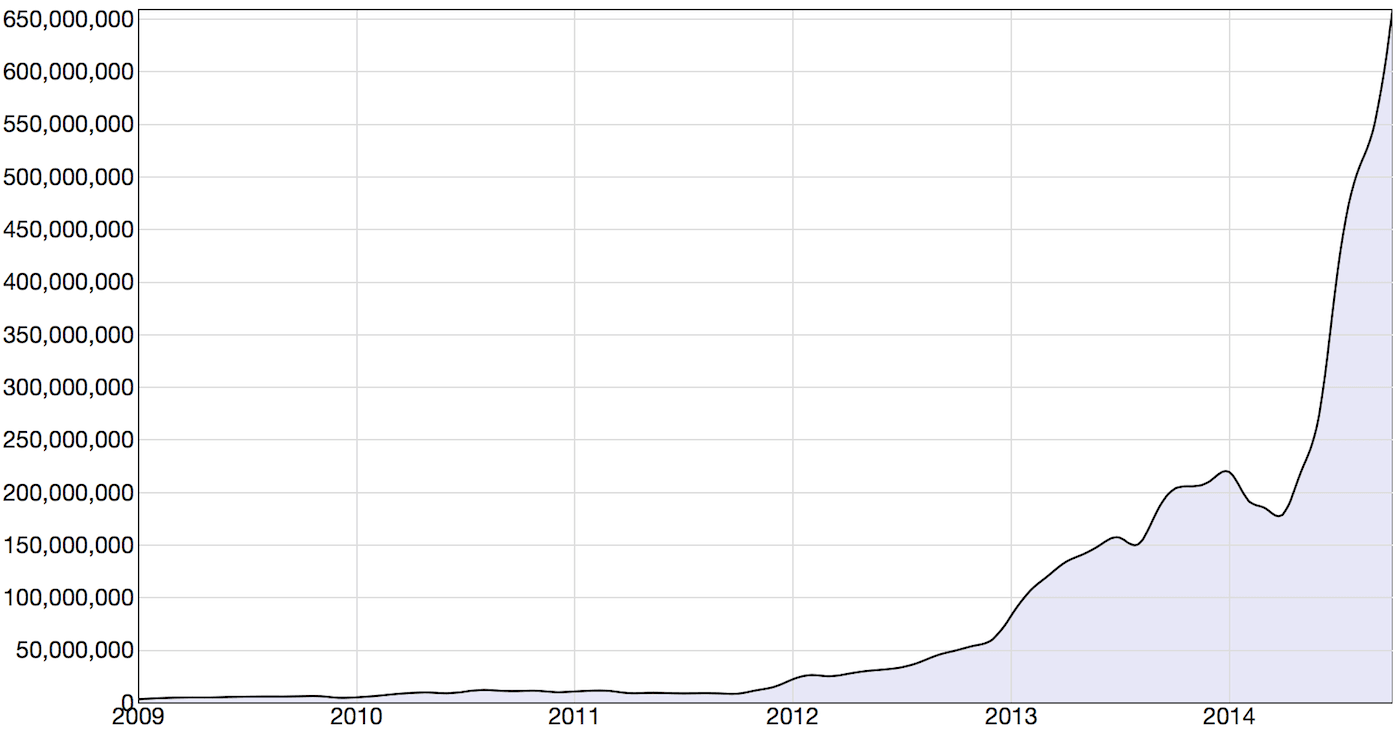
Figure 2: References Per Month (2009-2014)
So, which are the sources, and how do they contribute to our reference set? The data in the graph below is based on taking the top 40 sources each month since 2010. In total 298 sources have been in at least one of the top 40 lists, and the proportion of our complete set of references for those sources are shown in the stacked diagram. The white area shows the reference proportion of all other sources.
[sf_visibility class=”hidden-xs”]
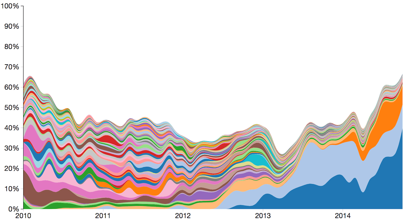
Figure 3: Proportion of Total Number of References for Our Sources (2010-2014)
Media Types
The proportion of references for our various media types show, as expected, that social media is growing much faster than other types of media.
[sf_visibility class=”hidden-xs”]
| Mainstream | Social Media | Blogs | Niche/Industry Specific |
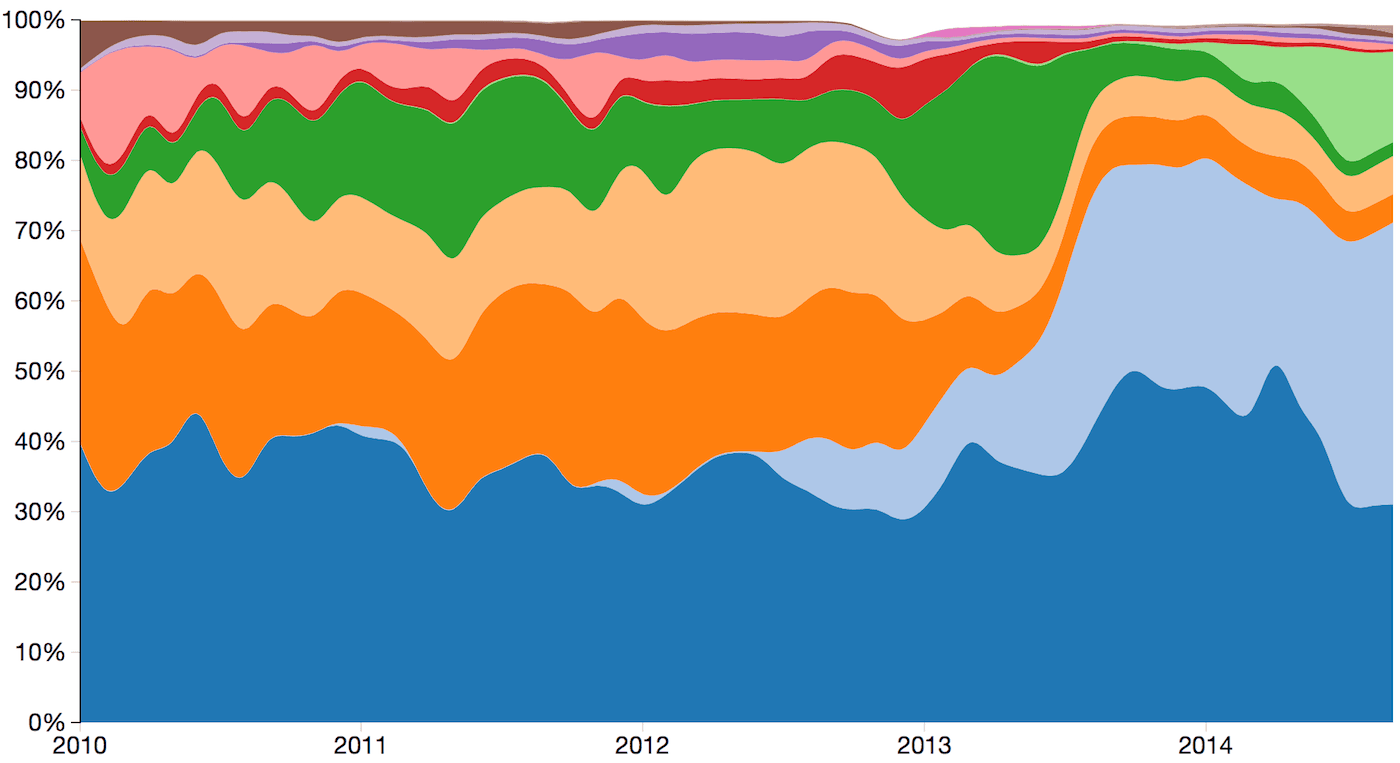
Figure 4: Media Type Reference Proportion (2010-2014)
Source Count Distributions
Below is the distribution of references per source for September 2014. Since the spread of reference count is huge, we use a log scale on the x-axis. We have a very large and diverse set of sources to provide excellent intelligence coverage across the web. Also it should be noted even social media sources actually represent many more sources as each author or contributor could be considered a separate source.
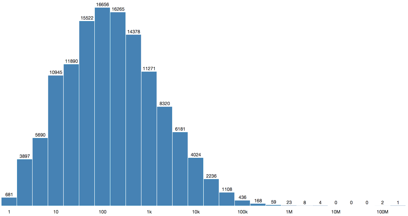
Figure 5: Source Reference Count Distribution (September 2014)
Hopefully you’ve enjoyed this quick behind-the-scenes look at Recorded Future data to learn what goes into bringing you the wonderful context for your analysis and intelligence!
Related